Monday, May 11, 2009

Ratios


The final result of the NGMS project was my concept of Ratios along with the Situated Learning theory by Jean Lave who says, "Knowledge needs to be presented in authentic contexts - settings and situations that would normally involve that knowledge.  Social interaction and collaboration are essential components - learners become involved in a 'community of practice' acquired.  As the beginner or novice moves from the periphery of a community to its center, he or she becomes more active and engaged within the culture and eventually assumes the role of an expert."  
The concept of ratios goes along with the ratio of light being diffused throughout the space and the ratio of the human body.  In order to create an active learning environment where everyone is engaged with the learning process, I used the concept of the human scale ratio with standing, sitting, and sitting on the floor and how that could be turned into a space.  The projector screen is the area of the room that is lit up the least and the opposite side of the room from the projector is the most lit up of the room to hopefully better the glare issue against the screen.


Northern Guilford Middle School 7th Grade Math Classroom

For the final studio project, we focused on the Northern Guilford Middle and High school and separated the schools into smaller groups of circulation, classrooms, media center, or art rooms.  I worked on the math classroom in the middle school and began playing around with different ideas for concepts through the overall class idea of nature.  I wanted to make the space a more inviting and enjoyable space by making it a relaxing experience the way that nature is.  I started out with the concept closer to the idea of driftwood because of the idea that it starts out one way and the ocean and surroundings shape it into something different and make it a very enjoyable piece still.  I wanted to relate this to the idea of the classroom being a way of shaping the students in it.  


After playing around with the idea of driftwo
od and talking to Patrick about my ideas, I started leaning more toward the idea of Ratios.  This is an idea that relates to nature as well as the classroom itself since it is the 7th grade math classroom.  I began playing with different ideas of ratios and wanted to try and have the room separated into "zones" and use different materials and colors to play off the ratio idea.  

Thursday, March 26, 2009

Northern Guilford Middle School


In efforts to better the environment at Northern Guilford Middle School, I decided to concentrate on a classroom.  The classroom that I am focusing on is the 7th grade math classroom belonging to Mrs. Arnold.  After talking with her I hope to be able to provide some options for the school to be able to make adjustments by changing the arrangement of the room and how the light in the room is handled.  The light shelf, as "economic" as it is, has become a problem for all of the teachers since it is too bright for when they are teaching on the projection screen.  There is no way to control the amount of light that comes in through the windows because there are no blinds or any blockage mechanisms.  There will need to be a way to solve the issues with the seating arrangements - the desks are connected to the chair and are beside each other making it hard for one of the students to get into their desk without bumping up against their classmate. 

Knoll - Atlanta


Perkins + Will


TVS - break room with very interesting modern seating surrounding the stairwell. 


Knoll - Their showroom building use to be a meat packing plant.  This room (more specifically where this window is to the right) is where they use to bring the animals up on a mechanism in the ceiling.  They came in through here and went to be turned into food. (ew)

Despite the thoughts of dead animals hanging from the ceiling this building was very interesting and had a lot of natural light.  It use to be two floors but the second floor has been removed and the ceiling opened up.

A car full of loot and a 5 hour drive


Herman Miller's showroom was very impressive.  They have a very modern twist to the work spaces they design.  Different elements provide privacy but also separate the people's desks.  The overhanging leaflet shapes on the power columns are very interesting and make the space feel very playful and whimsical.  


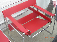
This is an awesome famous desk and chair that is so minimal but makes such a great statement.  I love the simplicity of the desk and the sleek form.


The Coconut Chair!  SO cool to see one in "real life."  


AWESOME!  I would love to have one of these lounge chairs in my home.  I've never seen one in this color and it is great!


The showroom has natural light pouring in through this windows in the roof.  It adds to the open plan and cuts down on the need for artificial light.


The newer "cubicles" that can be closed completely off but still feels like a lot of room when you're inside.  They also have little sliding windows inside them that open to the people around you and have shorter walls so you can still communicate with people.


The view of Atlanta from our hotel window.  The fast - paced life.


Somehow two people's luggage turned into a car FULL of stuff!  It is true that girls pack too much! 


The trip to Atlanta was a chance to see how successful firms conduct their business and what they have to offer to upcoming designers.  

Poetics of Space Chapter 7 "miniature"

To talk about miniature things in literature is hard to do in a serious tone.  When things are tiny they are hard to be seen as something that could actually exist - especially if it is a house or some other space.  To be able to take miniature illusions seriously we have to let go of our skepticism and cynical realities and allow ourselves to imagine.  Bachelard says that the miniature things remind us of childhood toys and we can make the small imaginary things reality by relating them to the reality of our toys.  Even when things are miniature, once inside a space the interior becomes larger than it really is.  It is very interesting how he points out that a botanist focuses on miniature things like flowers.  They are objective in their description of the flower in telling the shape, color, texture, etc. of the flower.  But when the description of the flower begins to take a shape that gives mental images of real things like soldiers standing at attention and children in a hammock, the botanist is thinking psychologically and using their imagination.  

Poetics of Space Chapter 4 "Nests"

Bachelard, in chapter 4, talks about the linkages of the home and the shelter of an animal.  We are similar in nature since we both take refuge in our comfortable places - like a burrow or a hole - and hide from the frightening or unpleasant things on the outside.  A nest can make us think of a comfortable place in our childhood or a place we would have liked to have known in our childhood.  Not everyone has memories and safe memories and feelings from their childhood, but the idea of a nest that is protective to an animal speaks to the idea that we can imagine what kind of refuge we would have liked to have had as a child.  "...in a garden, we grow more attached to a tree inhabited by birds."  We feel more of an attachment to something as static as a tree or shell if there is a living thing occupying it.  Our refuge is our safe place where we can feel secure and sure of ourselves.